|
June 17th, 2002
This old article is removed from the main website and is now hidden. But you found it!One of the more popular areas of my website has been the dragons. Now, I'm more of a giant robot kind of guy than a dungeons and dragons kind of guy, so it was a bit of a challenge to do these. I challenged myself even further by limiting the colour pallet on each of them. But I'm glad that I did, because they turned out very well. Now it just so happens that, in the process of doing one of them, I purposely saved my progress in different stages of completion with the hopes that I could one day share how it's done. So let's take a look at the makings of the Ice Dragon.
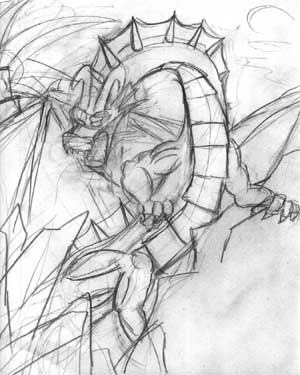
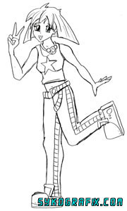
This is where it all begins. A very rough sketch without much regard for being neat and detailed. All of that comes later. What I do at the point is scan this, make it darker and sharper, print it out, and trace over it to make a good copy. I might do that a couple times before it's ready. Now, there were a few other versions of the ice dragon that I roughed out before I settled on this one, but they were not as dynamic.
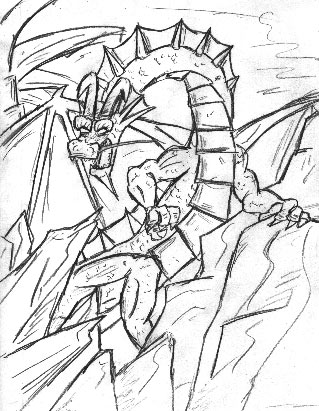
And here is the good copy pencil drawing. As you can see, it's much cleaner and better rendered. It's also got more detail, much of it I sort of make up as I go along. This is a good look at my rough pencil style before I hit it with colour. At this point I would remove all of the white space until I had nothing but the outline, then start painting underneath.
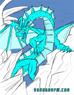
Looking like a bit of a cartoon now, hmm? These are just the flat colours. This is just done so that I can decide which parts are going to be what colours, and to separate each colour or significant area on a separate layer. It's important here to be as neat as possible, because these areas of flat colour become the stencils when doing the shading. That can prove to be difficult when working with the rough pencil lines. You don't want to miss a spot.
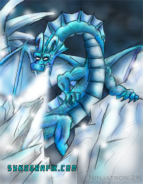
Here it is now after all of the shadows and highlights have been finished. A lot of the colour work has also gone into rendering the details. Now all that's left is to add some special effects.
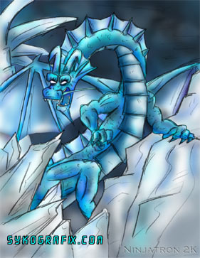
I added the ice breath and some shiny areas here, which essentially finishes it off. There are 15 separate layers at work here. I should probably point out that at this point in time I had just gotten a new computer and this was probably the first peice that I finished with it.
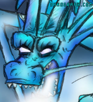
This is a slice of the finished product taken at 100%, meaning this is how big it is before I shrink it for the website. Now in hindsight I see a lot that I'd do differently now. There's too many visible jagged edges. While it may seem big to some, this is fairly small for me now. It's only at 150 dpi.
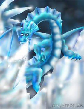
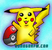
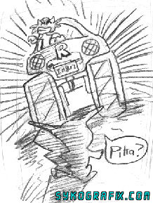
Just for fun, here's what it looks like when I take away the outline. Weird stuff! On the other end of the spectrum, here's a little drawing that I did for one of my cousins while she was visiting one day. She asked me to draw this for here. Then, when I did, I gave it to her, and she gave it to my sister. Whatever. But at least I was able to scan and colour it first.
Pikachu. Yay. Well, I'm sure that some of you may get a bit more satisfaction from this next drawing.
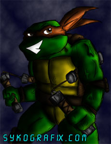
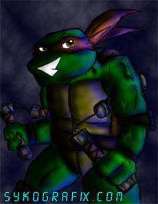
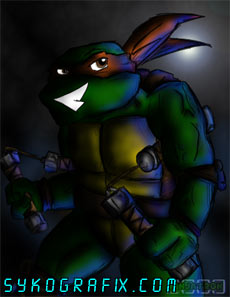
Here's Pikachu about to be run over by a monster truck being driven by Meowth of Team Rocket. Fun for the whole family! Coincidentally, I actually gave the original drawing of this away to a friend of mine, who thought that this was the funniest thing in the world. Ever since I started with this whole SykoGrafix thing, Ninja Turtles fan art has played a huge part in what I did. Originally, most of my visits came from the TMNT fan community. As I've said before, I would not be an illustrator is it were not for the positive influence of the Ninja Turtles and the people who created them. Here's a drawing of Michaelangelo that I did in between the old and current incarnations of SykoGrafix. I'm showing this here because it's another good look at how I do things. I coloured it 5 different ways before I was happy with it, and most of that just revolved around adding shadows and blue highlights.
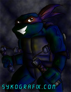
Here it is fully coloured but before I added any blue highlights and much of the shadows. Then beside that is my first attempt, which obviously has too much highlight and shadow
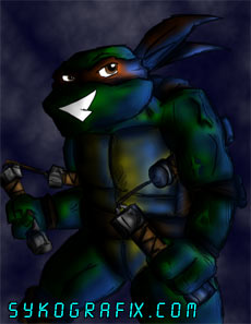
It's getting better in these two, but I still was not quite satisfied at this point. It was looking a bit fake.
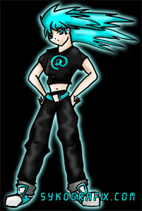
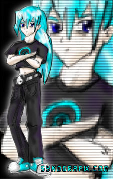
And here's the finished version, looking much better. You can see it bigger right here. It's interesting to see how much work and preparation goes into the colouring. And that's not even including the original drawing, of which there were at least 3 revisions. Now compare this to that first TMNT drawing. It's like night and day. It was around the autumn of 1999 where I once again found myself without direction in life. I wasn't in school, had no job, and was basically a pretty miserable dude, I'll admit. While certain situations changed and started to get better, I still had an empty feeling inside, as if my very existence was no longer fulfilling. I had nothing to work towards. All I had was a thimble full of talent and a dark voice in my head. That voice kept on repeating something to me, over and over again. It was really the only thing I had to work for, and the only thing that kept me going. That thing that I kept hearing was "SykoGrafix", and I knew it was the truth. It had to come back. It had to be better and different then it was before. I was toying around with ideas for a long time, even prior to his, but I knew then that it was finally time to act on them. I had a focus. A site with both style and substance. An electric blue monolith dedicated to personal expression on the Internet. I had to do it, or go insane trying. And yes, it was just as scary as I just made it sound. It took almost exactly a full year, but on Halloween of the year 2000, a new SykoGrafix was born. Working for many days on the layout and style of the page, I had finally come up with a design that I liked enough to go with. However, it was missing something. It needed a bit more colour and texture, and just another element that would make the opening page a bit more appealing to the eye. So a cute anime babe was the natural choice. I quickly drew one up and coloured it without thinking too hard. Much like the case was with Magenta, I liked the character very much. There was just something different about her, something slightly dark and mysterious, and it totally captured the essence of what I wanted SykoGrafix to be all about. Needless to say, I'd go on to draw her a lot more, and she's become the official mascot of this website. So here is the first appearance of the character who would come to be known as Cyan.
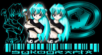
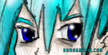
The character design as changed quite a bit, with certain details like a Yin Yang belt being added later. Originally when I posted this, I had applied a pixelation effect. Here she is before that was done. She's probably the hardest to draw out of all the characters I've ever designed. It took awhile before I could master a system of steps in order to draw her with the same look every time. And here is a good example of just that.
When I wanted to change the site design around, I came up with this to be the new title on the main index. But I worked on that design before uploading anything for so long that I eventually got sick of this, so I made another one, which did nothing but delay things even further. Of course, when you have two great anime style character designs with a colour theme, you might as well add one more. So to complete the triangle I created a new character. She doesn't have a job yet, but I still wind up drawing her quite a bit. So now I introduce you to the latest star of SykoGrafix, Amber.
I'm pretty sure that this is the first drawing of Amber that I ever did. However, unlike her friends, I had thought of the design and her personality before I actually drew her. I already knew what she was going to look like, where as with the other two I just drew something randomly and liked what I came up with. Now for something a bit more recent. I drew a picture of Cyan late one night because I was bored. I don't quite know what compelled me to draw this, nor do I know why I decided to colour it the way I did.
Well, it's not too bad looking like this. But in all honesty, It's a very sloppy colour job with many missing spots, stray pixels, and jagged edges. I really didn't care when I was doing this. Also, I did not erase any of my construction lines before I scanned, so you can see all the loose pencil work, which is kind of interesting, I guess.
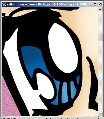
Now you can see what I'm talking about. This is a piece of it at 100%. Look at those ugly lines and missing spots. This is from before I added that cheap background. You can see bits of yellow creeping out wherever I missed a few pixels. Probably should have spent more time on this, but whatever. It's a good example of how I rough out a drawing, and of how big I work. And of what not to do. Now as a finale, I've got another example of how big I work, this time from something I did not too long ago. My Sailor Moon piece came out pretty well for such a quick job. To give you and idea of how big I work now, and how much both my drawing skills and colouring skills have improved since those early days, here is a little price of it seen at 100%, as taken from a screen capture at 800 x 600 resolution.
Yep, I'm obviously totally insane for working that big. It's 82.4M, 4800 x 6000 pixels, and 600 dpi. In other words, it's BIG. But I like it that way. Some may say that it doesn't need to be that big, and I could have done it at 300 dpi. But I can tell the difference. And so ends our tour of the mind of Ninjatron as it relates to Beautiful Digital Chaos. I hope that in reading this you have learned something, not only about how I do my work, but about now important this website is to me. And it's somewhat ironic that I've shared all of this with you, as I feel that my work here on the site is about to take another corner. At the time of this writing, I am awaiting my second year of college and will be majoring in illustration, I'm learning some new computer programs, and I'll soon be getting a digital drawing tablet. So the best is yet to come. I'd just like to say thank you to all of you have taken the time to look through the site over the years, especially those you who have been coming since those early days. I've lost touch with a lot of you folks, and I'd like very much to talk to you again, so feel free to contact me at any time. I don't get paid for this site. I don't keep track of how many hits I get. The only thing I really get out of this site is your feedback. And I need that feedback in order to know if people have actually been here. So thanks to those who have told me what they think of the site, no matter what you said. If you have yet to do so, what the hell is wrong with you? Make yourself known! Hey, even if you've done it before, do it again! I want to hear from you, because this website is just that important to me. Hopefully after reading this gut-spilling article, you all realize that now.
Long live SykoGrafix.
Sayonara.
So are you going to contact Ninjatron or are you going to be a punk? Come on, you know you want to.
|
|
|
|
|